ICE Mortgage • Financial • Admin Tool
Increasing loan throughput with an action-ready data-driven dashboard
Objective
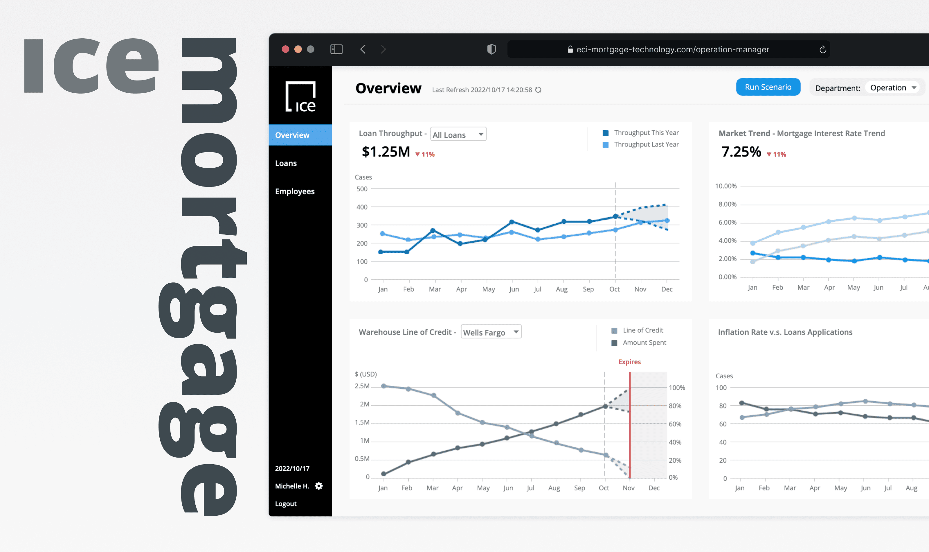
The project was to design a two-viewed dashboard that visualized complex mortgage data, prioritized and addressed different user pain points to increase loan throughput.
Team
Individual
Client (Stakeholder)
Role
UX Design,
Data Visualization
Tools
Figma
Axure RP
Timeline
6 Weeks,
Fall 2022
Outcome
Positive comments and feedback from stakeholders
ICE Mortgage Stakeholder
Visually very appealing and use of color, charts, etc. It's clean which makes it easy on the eye. Good understanding of process.
Professor D. Rosenberg
This is a very elegant design and clearly thought through regarding the needs of each persona. The overall foundation and IA are solid and well implemented.
Background
What is the project about?
This project was a sponsored academic project partnered with ICE Mortgage, a company focusing on cloud-based mortgage services.
In this project, ICE Mortgage wants to support their customers (banks) in improving efficiency across the loan processing time and increase loan throughput.
Problems
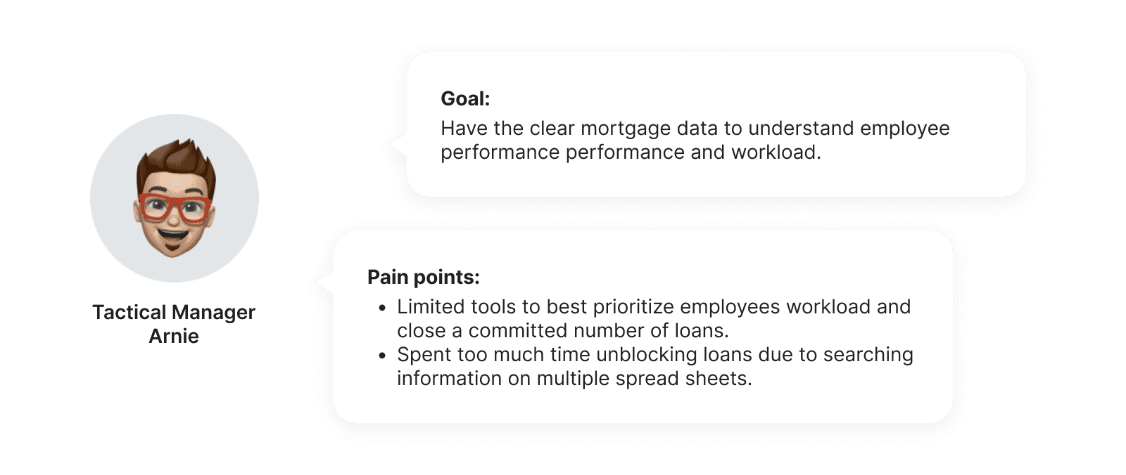
Problem 1: Difficult to manage officers' capabilities
Tactical managers encountered challenges to easily oversee staff production and re-assign works effectively for closing committed loans in time.
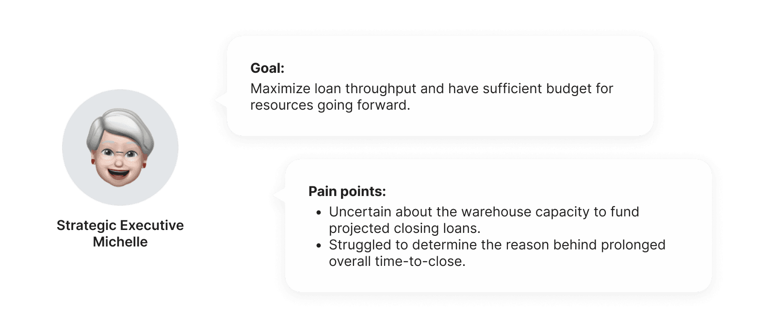
Problem 2: Challenge to forecast potential delay factors
Strategic level executives faced challenges to anticipate potential delays and therefore demanding a streamlined process to quickly identify critical factors influencing loan closing time.
Key insights
One dashboard → Two layout views
In order to tackle the above mentioned problems, I decided to integrate a dashboard with two different layout views to cater to the needs of both critical user groups.

Manager View
Overviewing employee workload and performance, ensuring a streamlined loan processing flow.

Executive View
Overviewing closing loans and forecast warehouse capacity to ensure adequate funding.
Design Goal
How can we organize complex loan data into an action-ready dashboard?
The absence of a high-level tool to comprehensively oversee data and staff performance was identified during problem discovery. Difficulties arises when optimizing staff workloads and foreseeing warehouse capacity, leading a decrease in loan throughput.
Conceptualization
Conceptualizing the dashboard information hierarchy to optimize user cognitive load
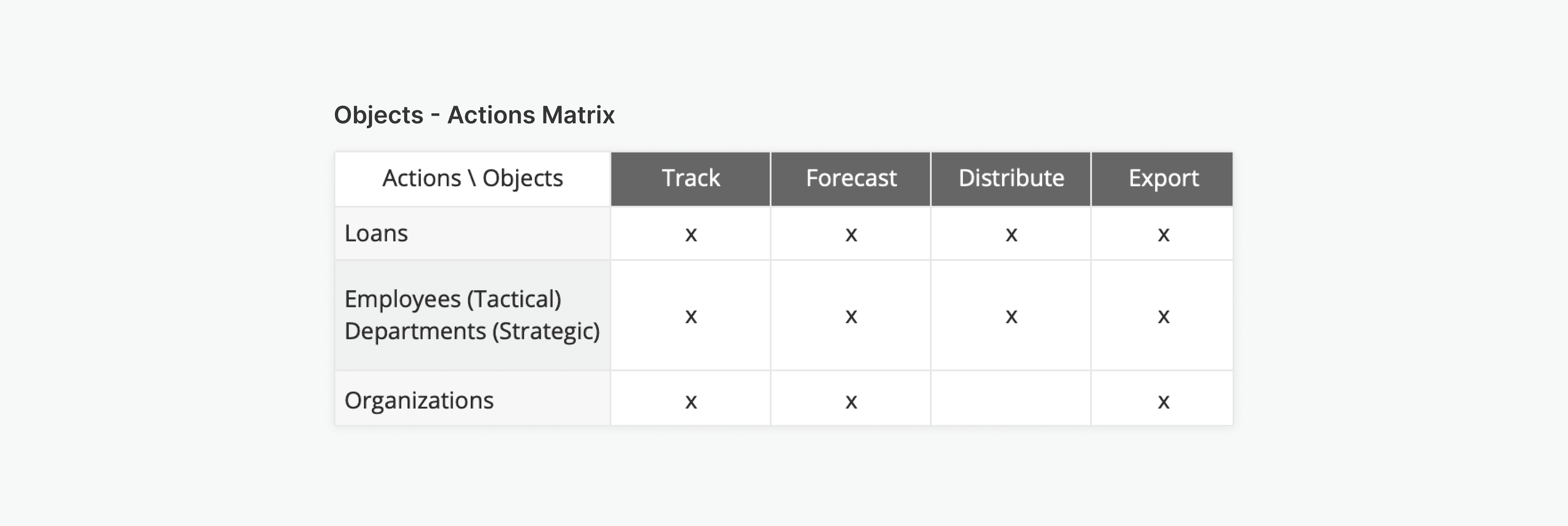
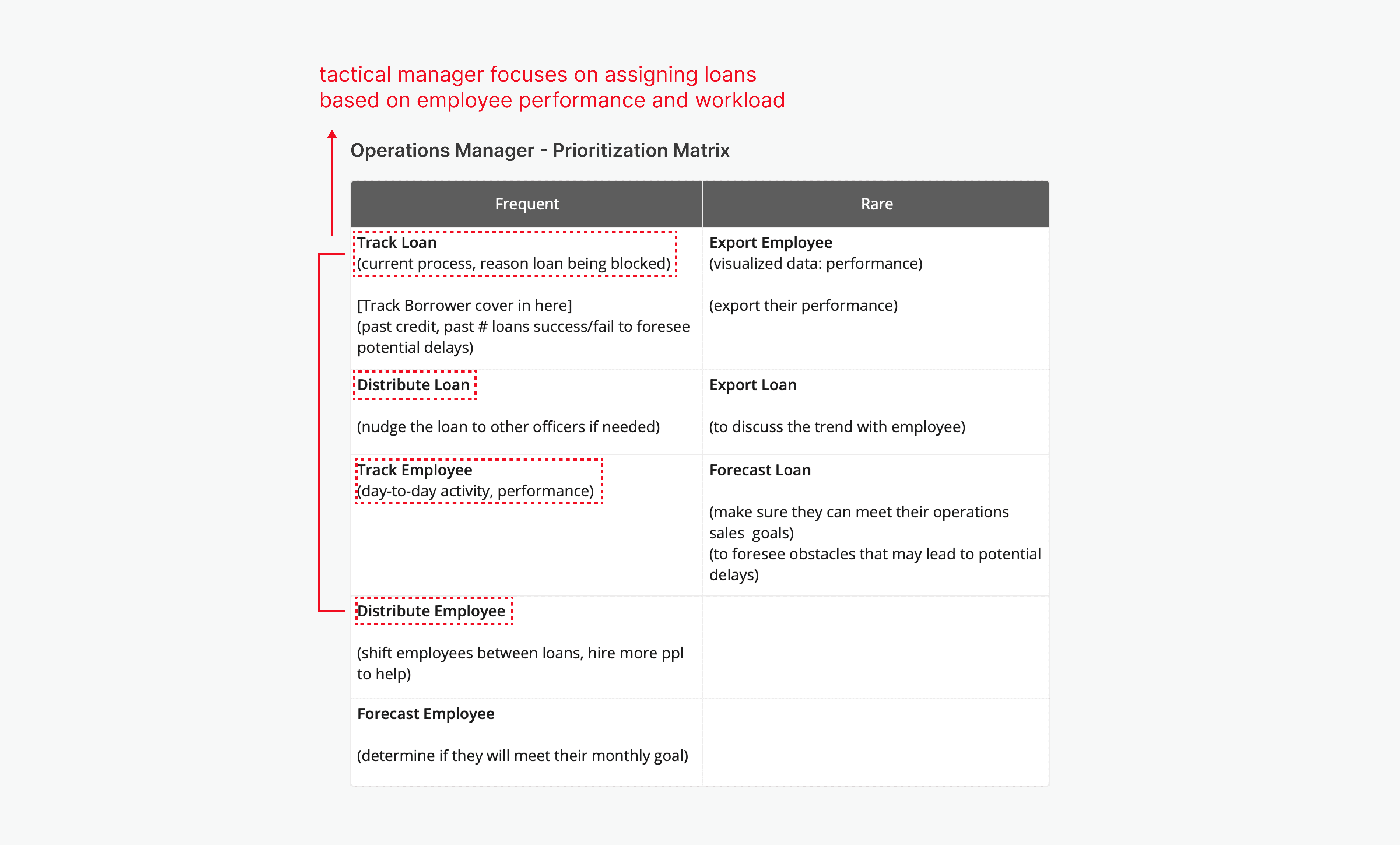
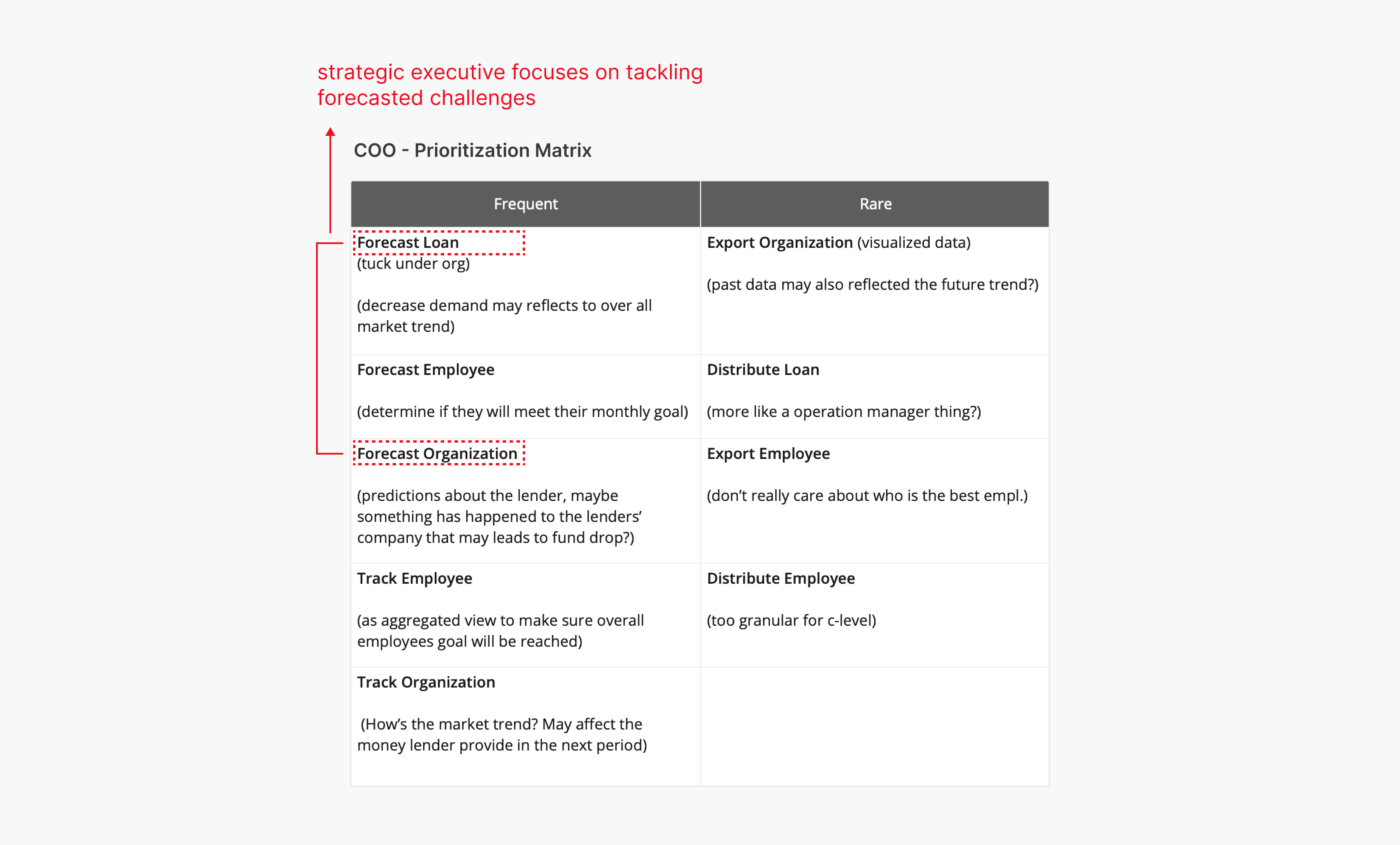
After identifying the major jobs to be done, they were transformed into a matrix using actions and objects. This ensures a clear information hierarchy, optimizing user cognitive load.
Jobs-to-be-done
Defining jobs-to-be-done based on the priority focuses
Based on the conceptualization insights, aspects of jobs-to-be-done were defined and taken into consideration.
Employees 👤
Time takes to process a loan
Number of loans processed
Return of Investments
Loans 💰
Loan processing cycle-time
Number of loans processed
Profit generated per loan
Organizations 🏛️
Target numbers to close loans
Warehouse fund and capacity
Amount of income earned
Design System
Establishing an action-oriented and trustworthy platform.
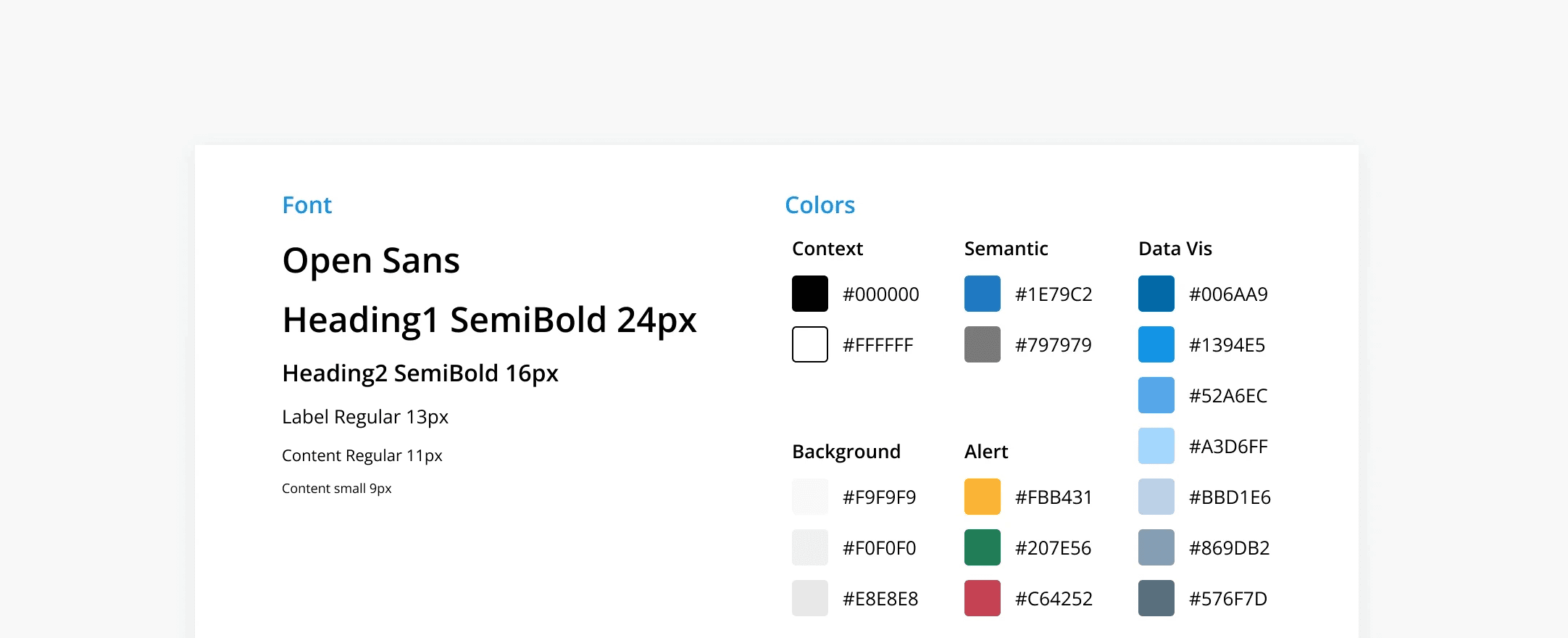
I chose blue as the semantic color and overall color theme for data visualization design because blue to align with ICE Mortgage’s brand color, moreover, color blue generally gives users a sense of trust, reliability, and professionalism which fits perfectly within the mortgage industry.
Brand Voice: Trustworthy and Professional
ICE Mortgage is all about mortgages and loans. To align with the company vision, I designed the brand voice to convey a sense of trust and professionalism, letting consumers feel reliable about applying loans.
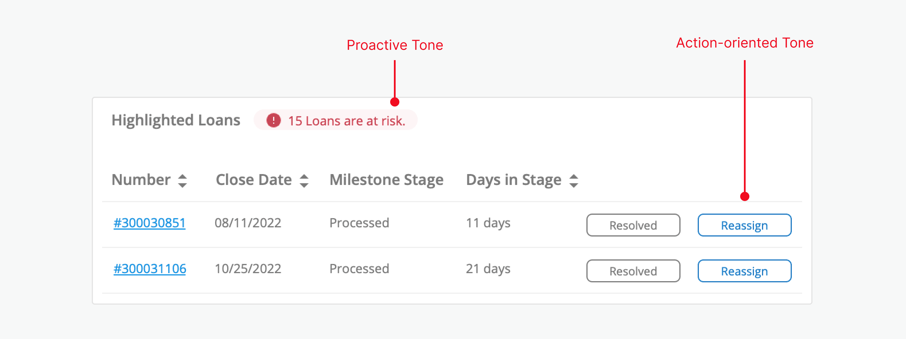
Brand Tone: Action-oriented, Proactive, and Formal
I defined the brand tone of the dashboard design as action-oriented, proactive, and formal. The tone of the dashboards conveys a formal and knowledgeable tone to assist officers' decision-making with transparent and solution-driven suggestions.
Deliverable: Manager
Dashboard Design: Manager
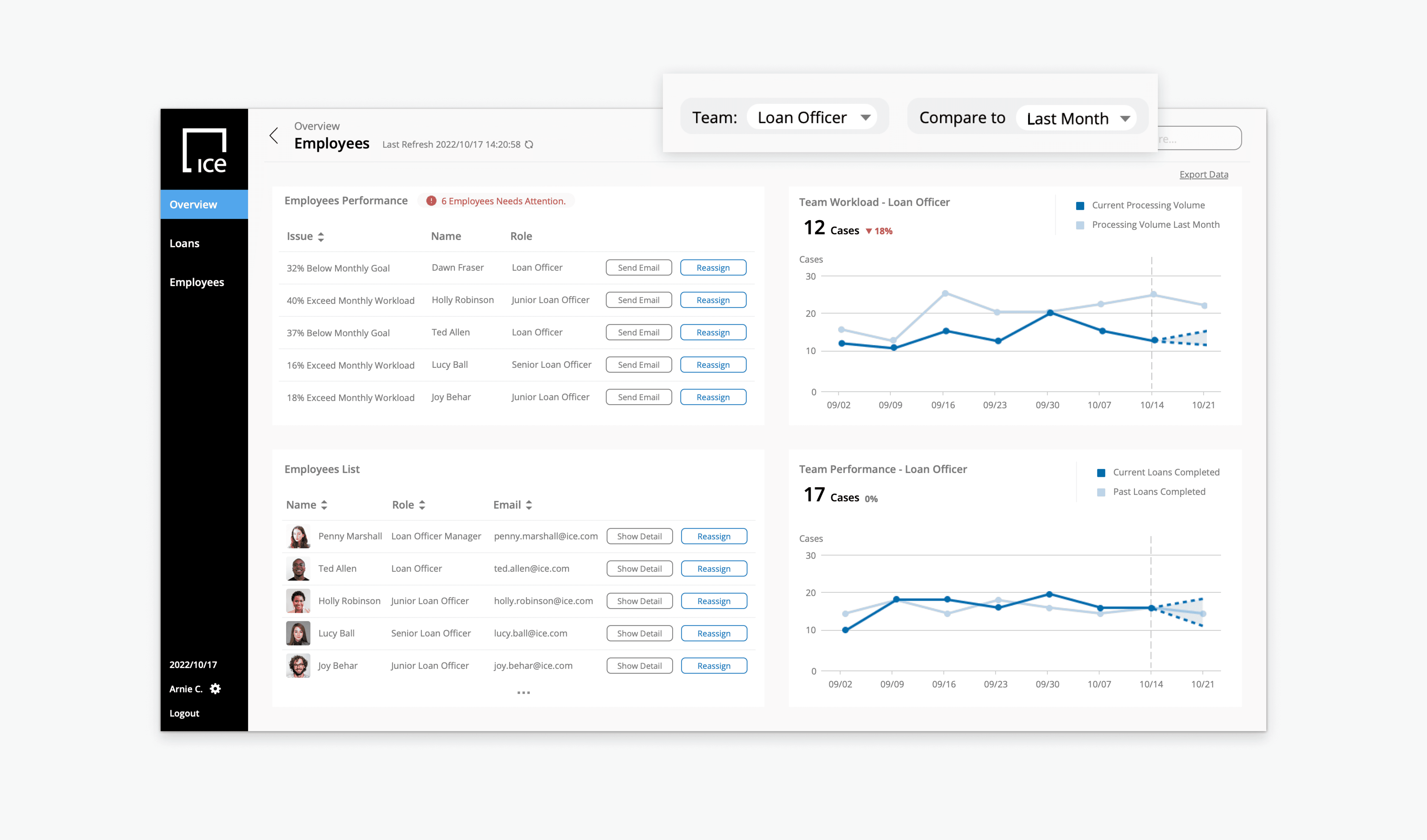
Managers focuses on re-distributing loans to employees
Managers face challenges in foreseeing factors causing delays and effectively allocating employees. The primary focus is on providing an overview of overall employee workload and detailed loan-blocking reasons, offering managers actionable insights.
Highlight risk loans and prompted proactive measures to prevent bottlenecks
In the dashboard design, I converted Excel spreadsheet data, emphasizing potential high-risk loans ready for decisive action through clear, highlighted indicators.
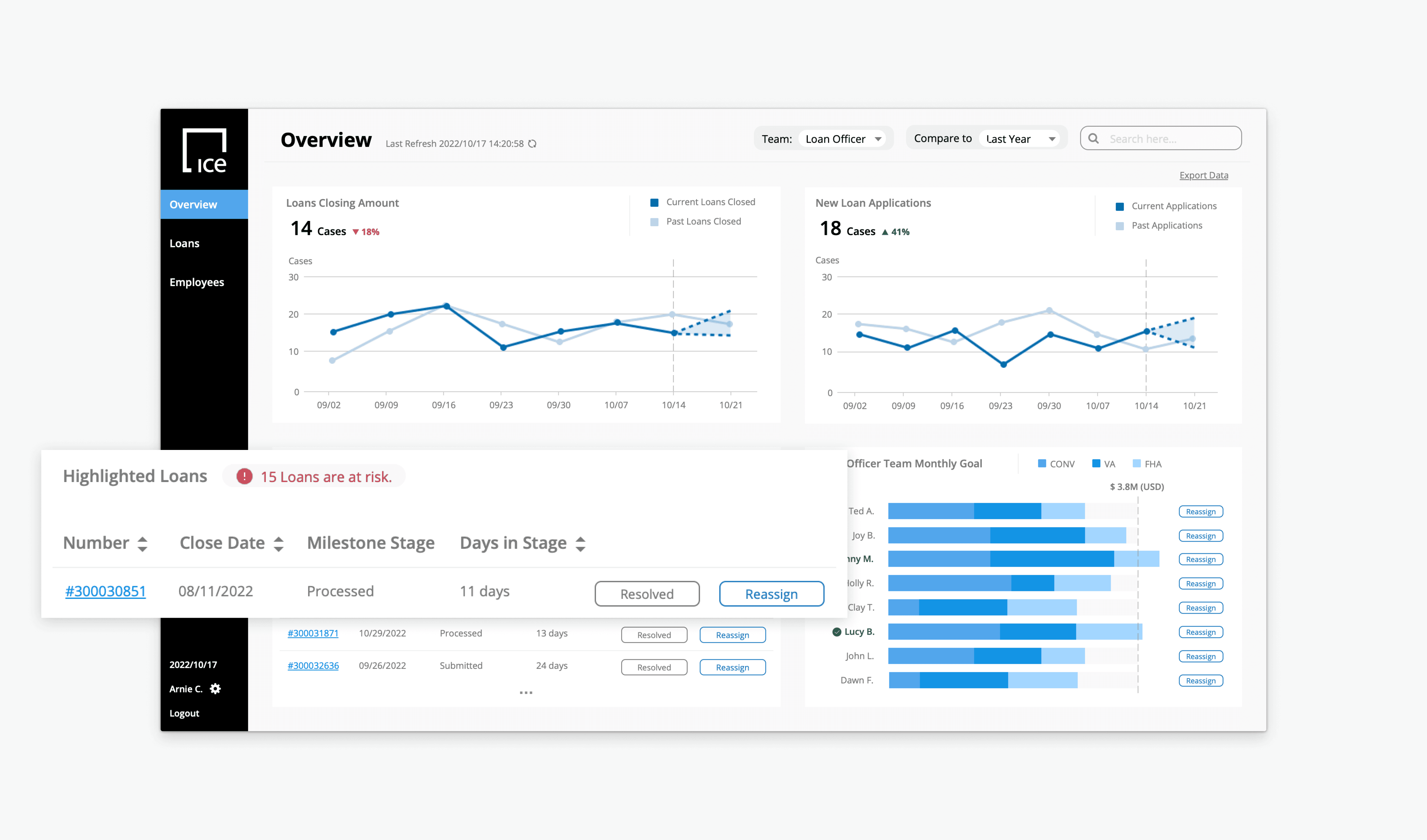
Clear actions facilitating data comparison, allowing oversight of trends across different time periods
To visualized the comparison of data points across different time periods, I incorporated a dropdown at the top right of the dashboard for comparing different data trends.
Deliverable: Executive
Dashboard Design: Executive
Prioritize tackling forecasting future trends for the strategic executive
The executives' primary needs involve effectively monitoring loan funding warehouse capacity and maximizing loan throughput.
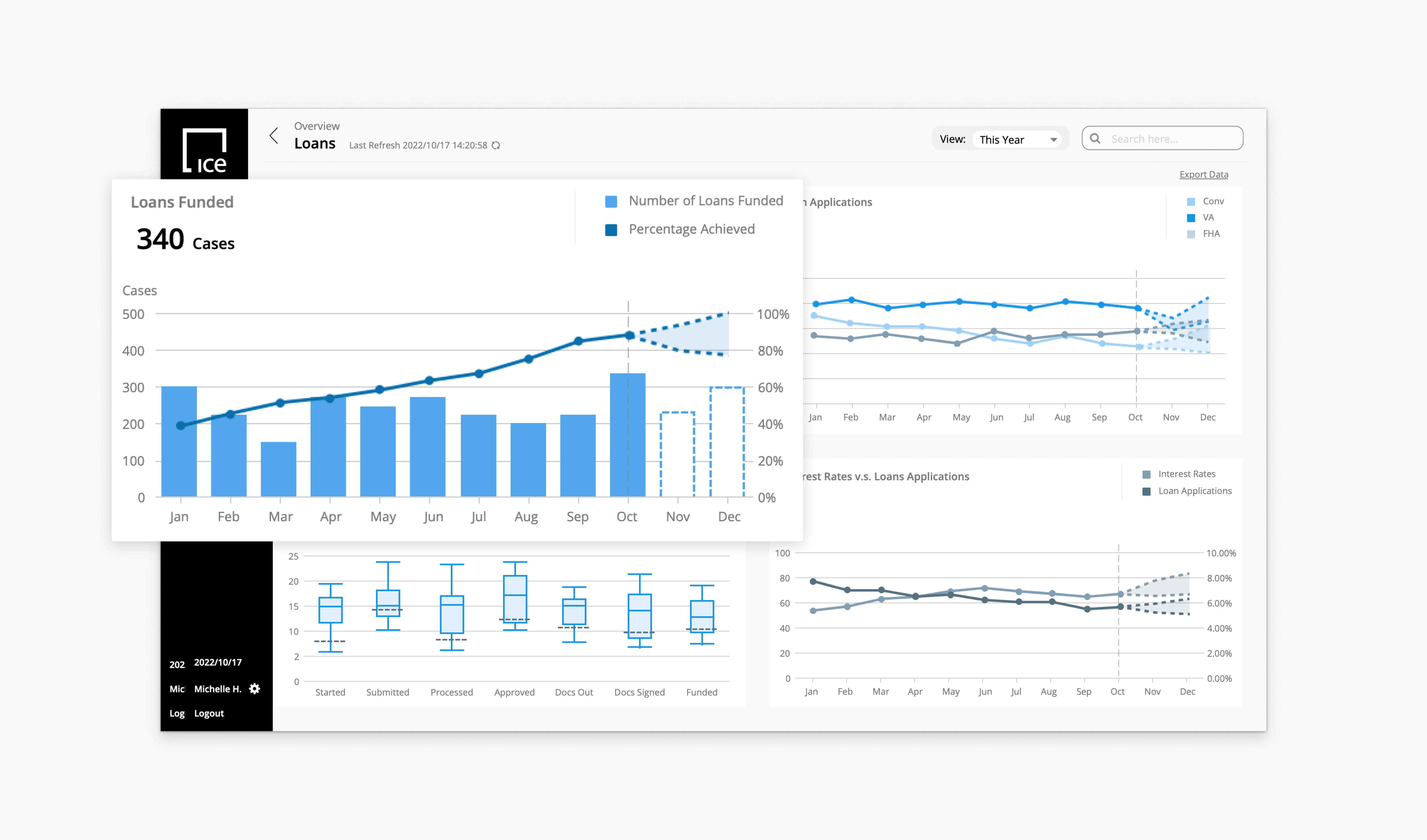
Forecasting trends to ensure sufficient funds for processing committed loans
In the dashboard design for strategic executives, I prioritized analyzing future trends to ensure goal achievement.
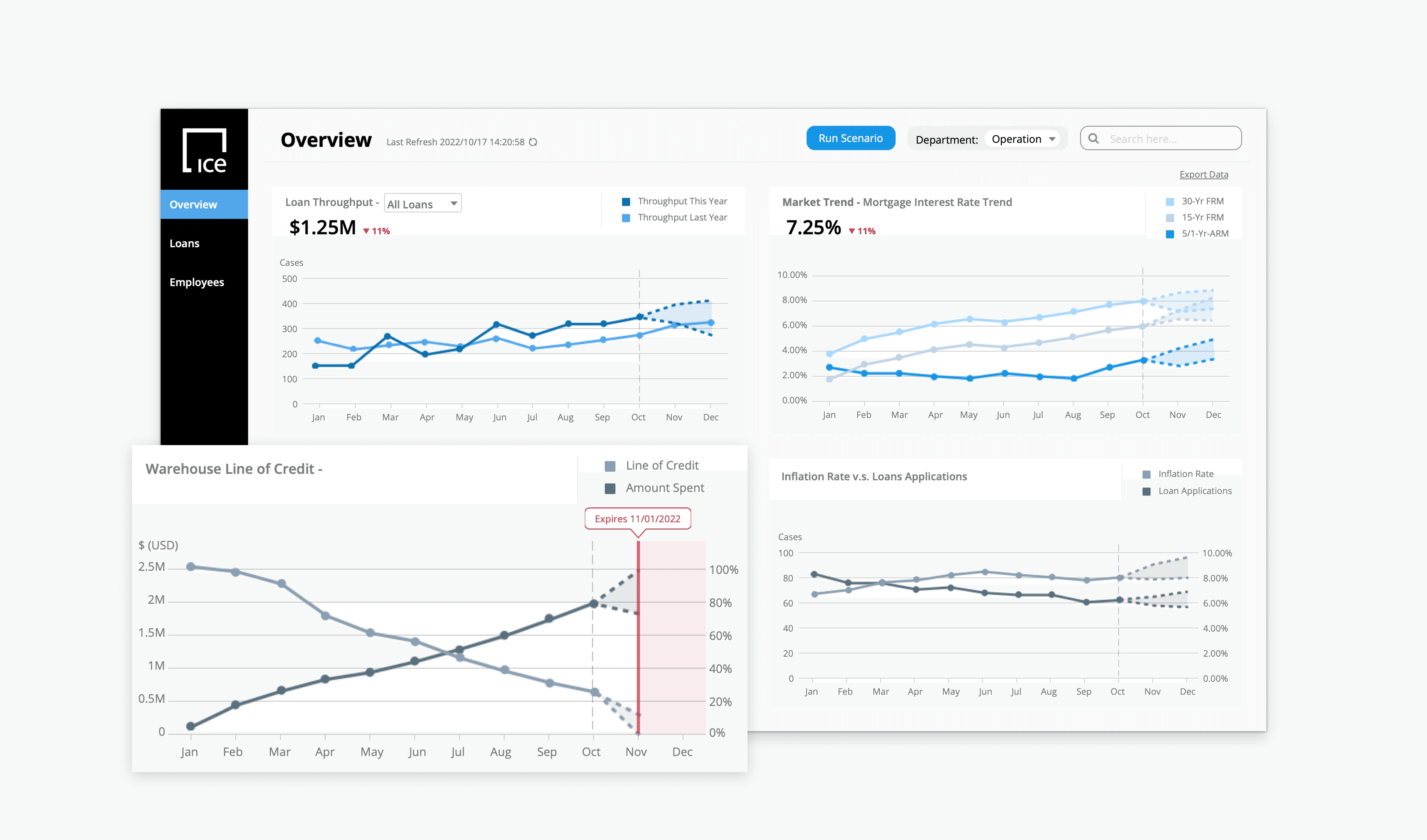
Clear data visualization for future resource budgeting
Through micro-interactions, like hover for details, users can oversee potential risks and bottlenecks, and take actions proactively.
Takeaway
I learned to design solutions even in a unfamiliar domain…
As a designer, we sometimes have to cope with domains that we are not familiar with. This is a project in the mortgage industry, which was a great experience for me to get hands on experience in designing a new field.
The limitations.
Every project has limitation, due to the short time period working on my own, I had to compromised in order to deliver the final outcome on time. If I have more time on this work, I will put my design to usability test and comply my design with the WCAG guidelines to improve accessibility.
