Connect Link • SaaS • B2B / B2C
Reimagine the information architecture to streamline professional networking experience
Objective
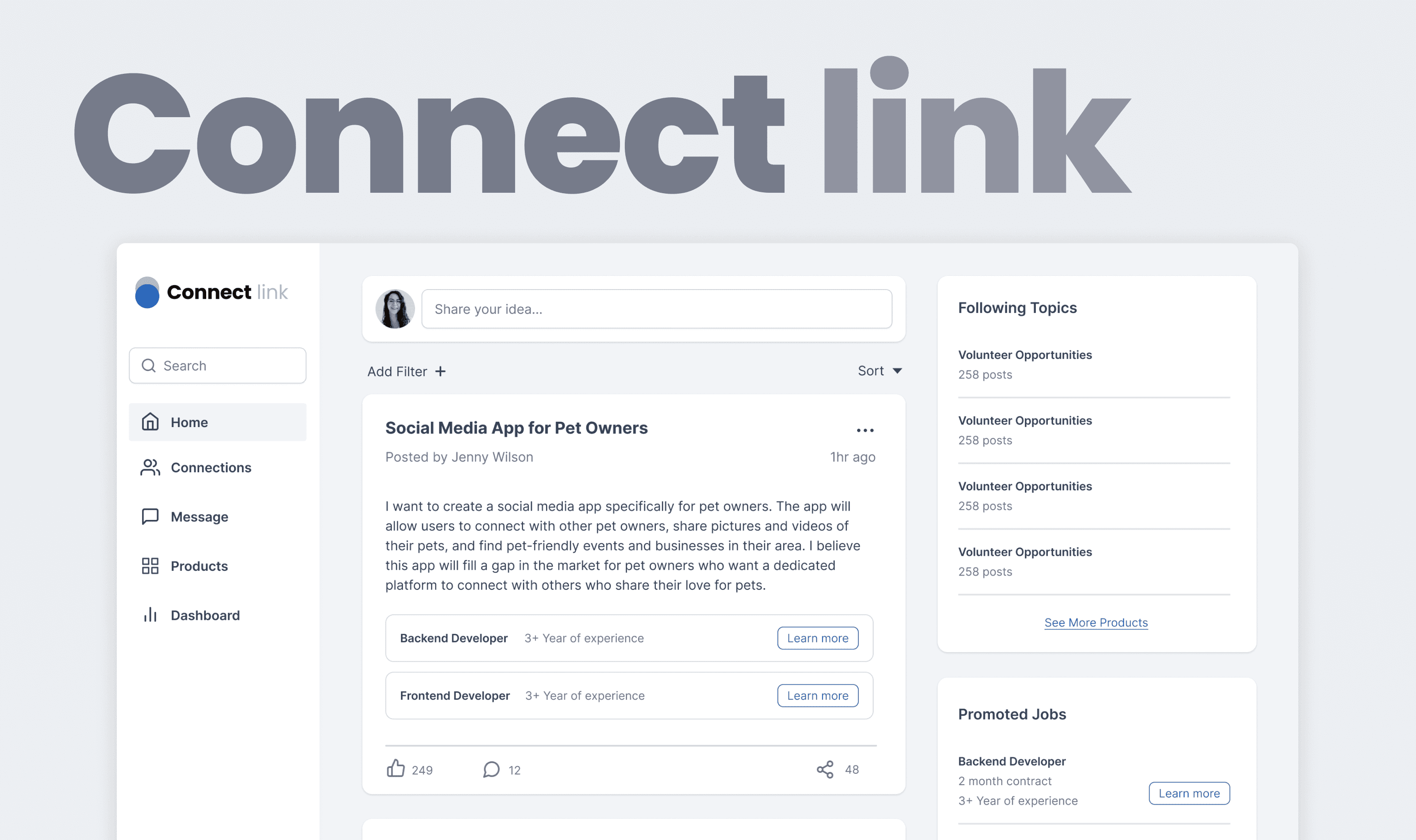
This project was to redesigned the Connect Link dashboard, and enhanced information architecture to minimize user cognitive load and further improve user conversion rate.
Team
UX Design Intern
Founder
Role
UX Design,
UX Research
Tools
Figma
Timeline
Aug – Oct, 2023
Outcome
Minimize cognitive load to maximize usability, expected lifting conversion rate.
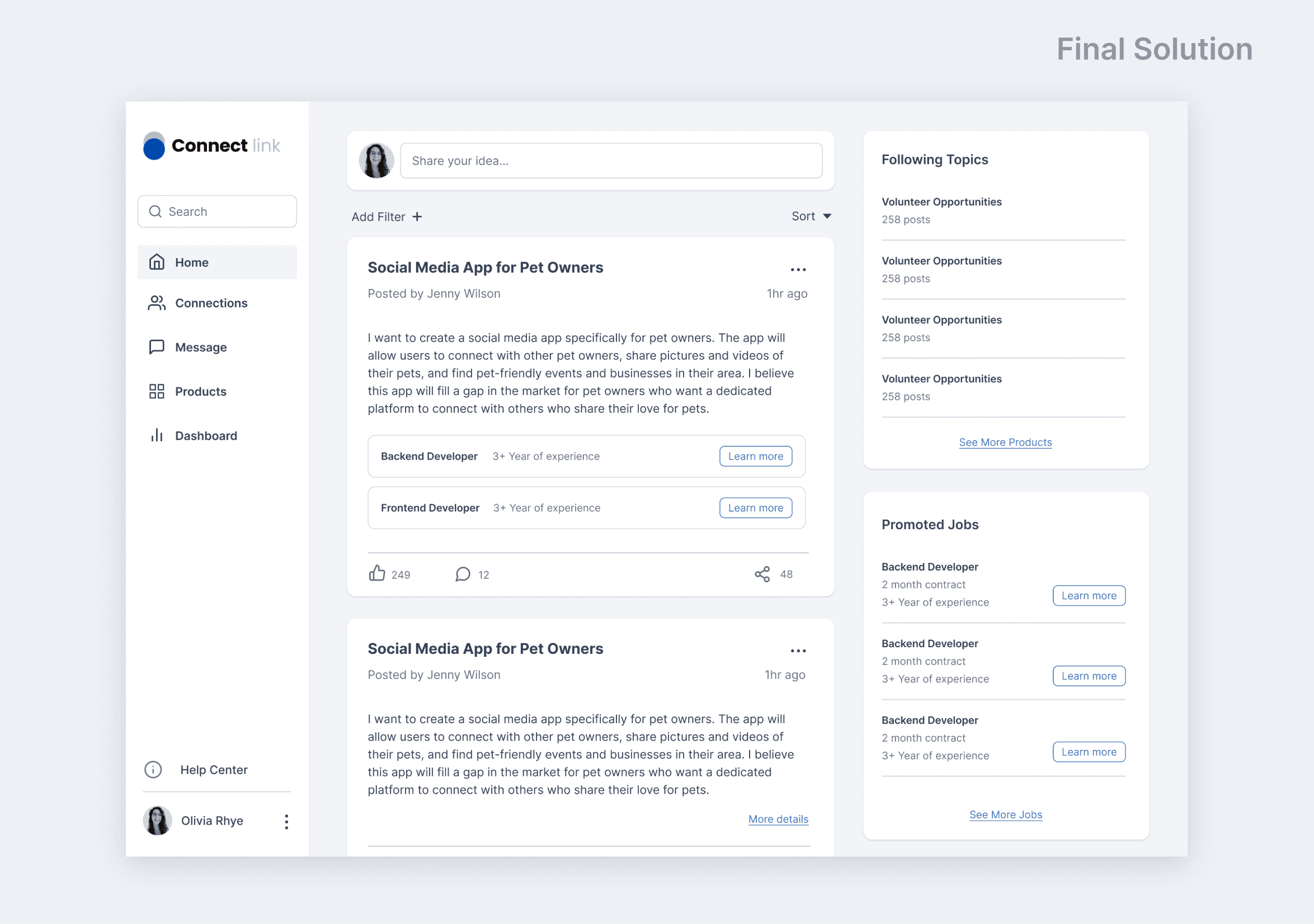
During internship, I spearheaded the redesign of the Connect Link platform, addressed information architecture gaps, proposed optimized wireframes that reduce user cognitive load, which could increase user conversion rate after launch.
By identified existing design gaps and optimized information architecture hierarchy, my design solution results in a 36% reduction in development time costs.
Problem Discovery
High cognitive load → Overwhelming information hierarchy and navigations
I was assigned to design for the Connect Link platform, a cloud-based networking platform to match businesses and individuals with service providers.
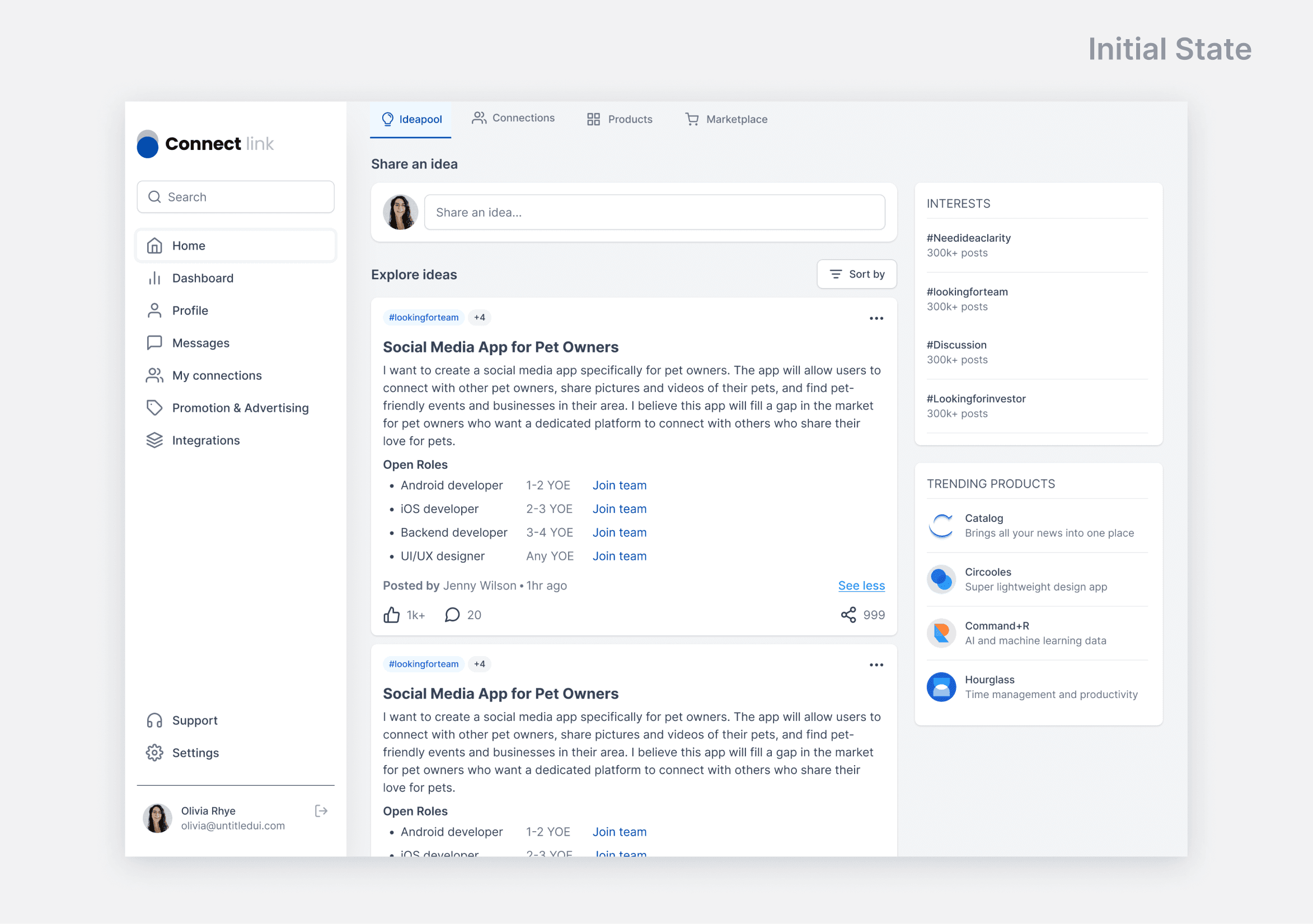
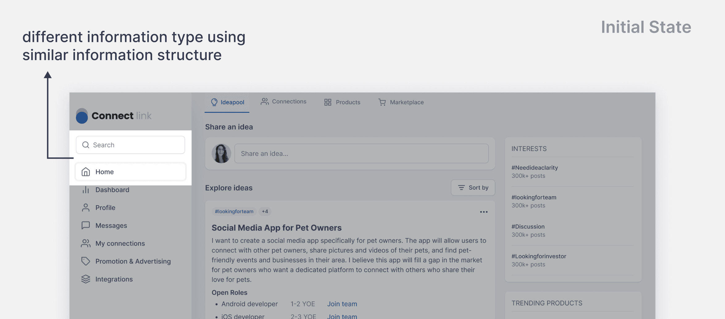
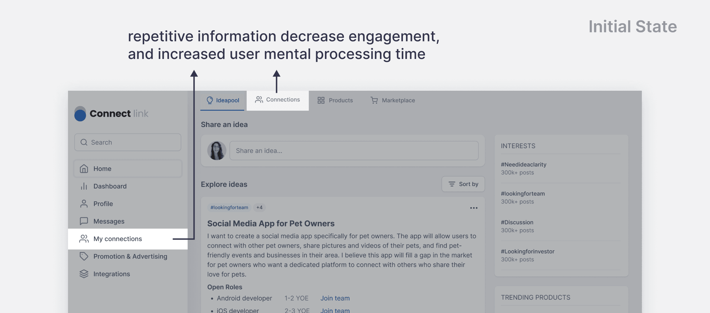
During my first week on the project, I conducted a design audit on the platform and found the navigation to be cumbersome. It had me thinking, "If I don't know how to use, new users will be even more confused," so I began with improving the information hierarchy.
Design Goal
How might we improve the information architecture with minimum adjustments?
The founders were expecting to see the design completed within 2 months to meet their project timeline. Hence, it was important to enhance the overall information hierarchy without starting from stage zero.
Solutions
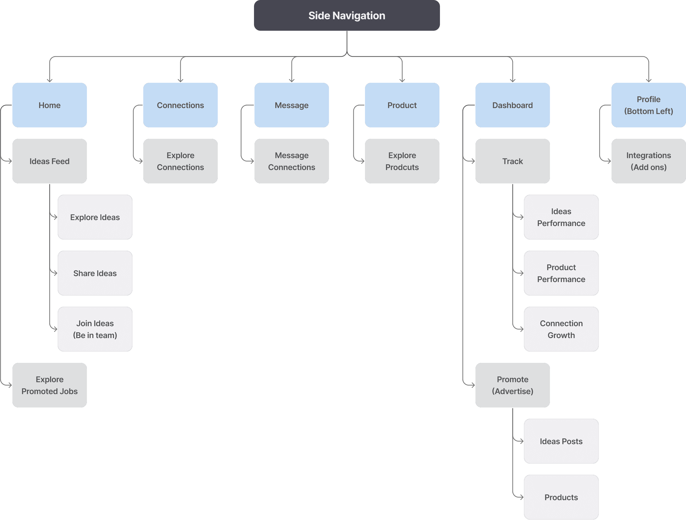
Site Map: Reconstructed the information architecture for a clear and intuitive hierarchy
To addressed the challenge with limited time, I created a site map including the key features of the platform based on the jobs to be done statements.
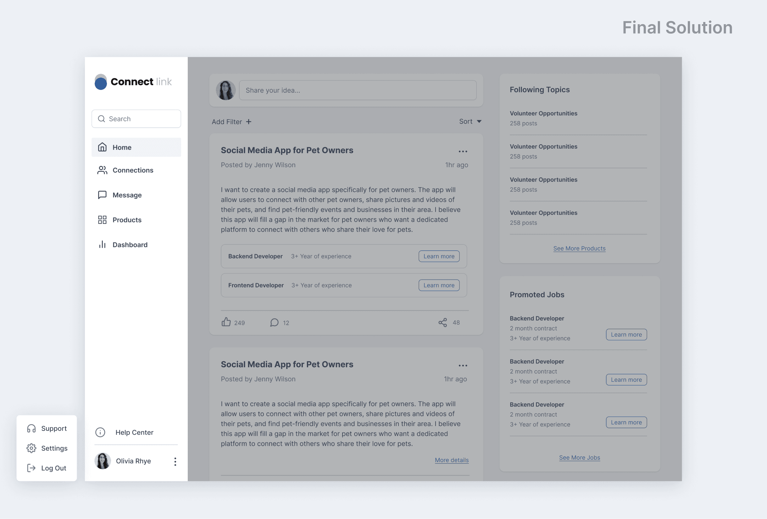
Navigation: Two Repetitive Menus → One Clear Side Menu
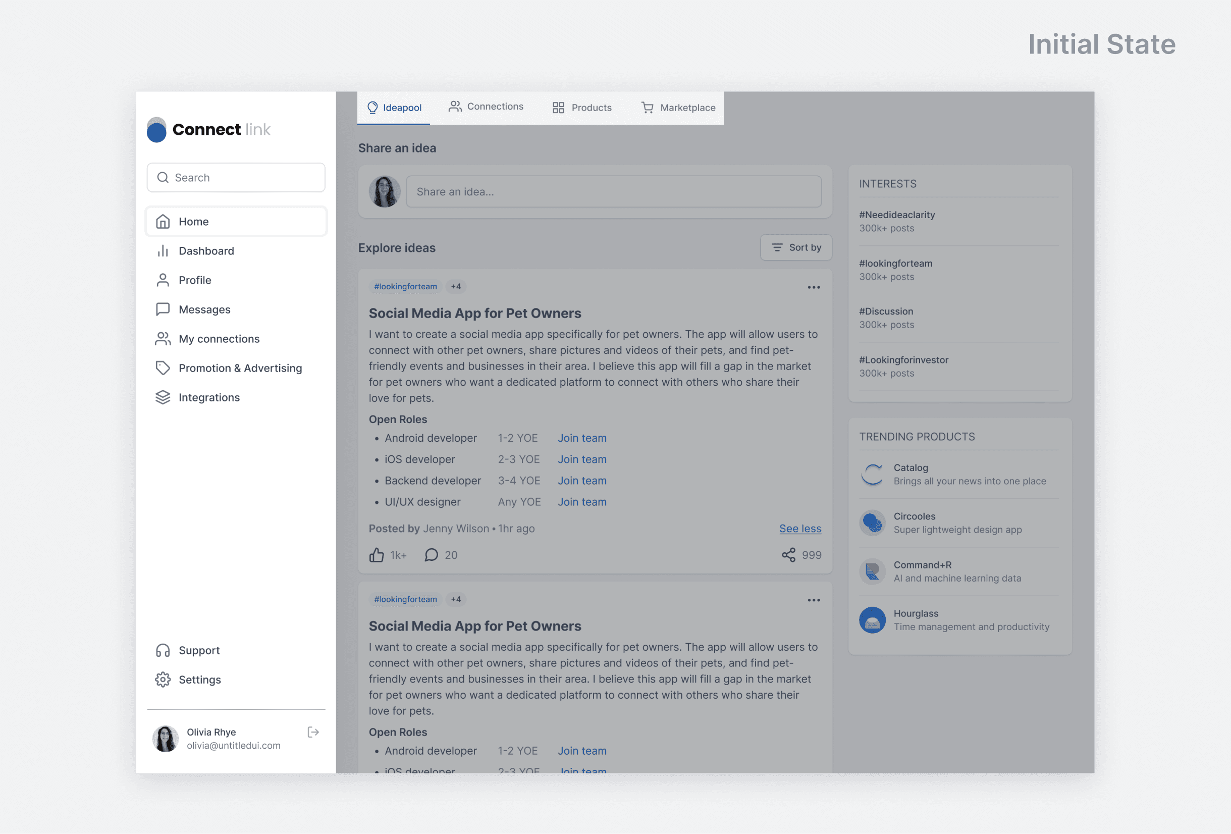
The original home screen consisted of two menus, each containing different buttons with similar features, causing confusion. By reconstructing the menu navigation, the new menu significantly reduced the cognitive load and exhaustion associated with finding the right page.
Zooming in: Information architecture
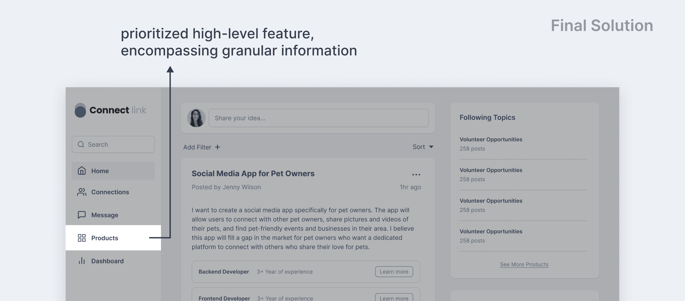
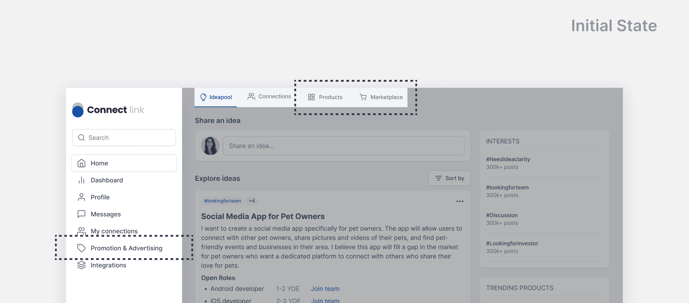
Grouped similar information and prioritized higher level features.
Diving into the features, I realized that 'Products', 'Marketplace' and 'Promotion & Advertising' are just representing different stages of the 'Product cycle'. Therefore, by providing an entry point at the highest level, users can easily navigate to and engage with any stage of the product cycle.
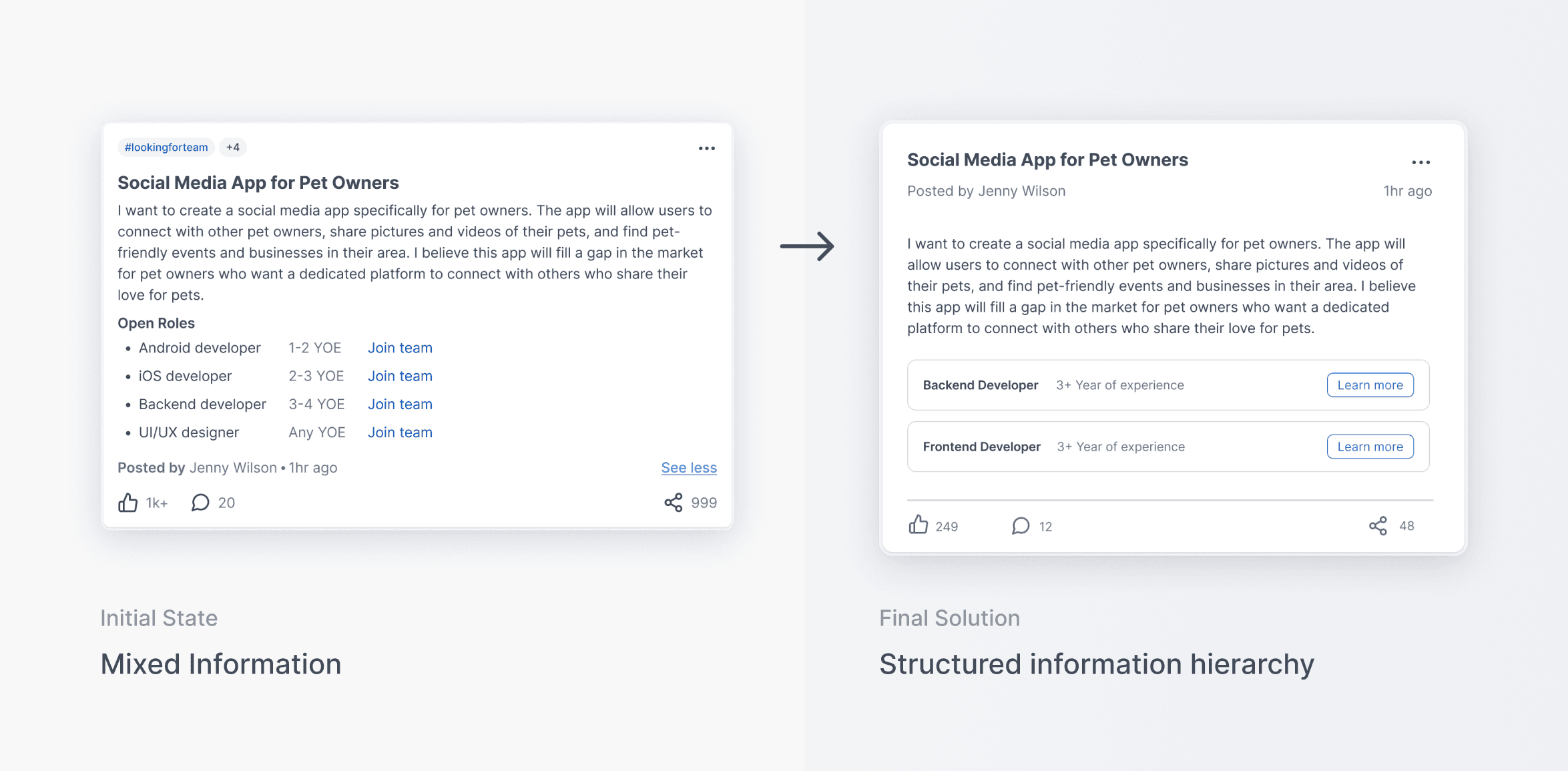
Consistent information hierarchy across the platform.
I implemented a clear information hierarchy across the entire platform to reinforce a straightforward and easily understandable structure. Taking idea posting as an example, by clearly distinguishing the hierarchy of content and job openings, users can quickly grasp the purpose and flow at their first look.
Takeaway
I learned to navigate through ambiguity in a fast pace work environment!
From this internship, I had the opportunity to apply my knowledge in a dynamic environment, navigating myself through ambiguity. With the improvement of the information architecture, the development time cost was reduced by 36%. This experience highlighted the significance of balancing between time constraints, business objectives, and the ultimate design outcome in a real-world setting, which was something that wasn't taught in school.
If I have more time on the product, I would conduct a usability testing after the first phase launch and made more iterations based on the insights to improve usability and overall experience.
