Dog Adoption App Design
Increase Adoption with Dog Matching
Team:
3 UX Designers (Responsible for Web, Mobile, Business)
Role:
UX Design (Individual work – Mobile App Design)
Timeline:
6 Weeks, Spring 2022
Tools:
Axure RP, Figma, Zoom
Background
MatchDog is a non-profit dog rescue center and shelter. This project aims to present cohesive user journey and mid-fidelity prototypes spanning web and mobile designs for consumers and web design for administration employees.
Scope for design:
Match users with the most compatible dogs based on different requirements.
Contribute to MatchDog rescue service.
View recent matches after completing the questionnaire.
Share happy stories in a community post-adoption.
Insights
New dog owners are uncertain about which dog would best suit their lifestyle
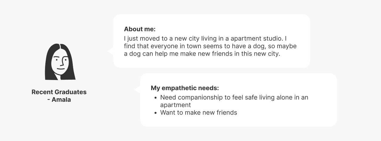
Users who visit the MatchDog app might want very different dogs. To cater to a diverse group of users, we created four different personas with unique empathetic needs.
Consider one of these personas, Amala, who desires a dog that is social and for her in making new friends. For her, more affectionate dog breeds would be an ideal match.
Design Goal
Pairing the right match for both the dog and the adopting family
I designed a mobile app to match potential adopters with shelter dogs to fulfill this goal. The app provides an end-to-end service, from looking to adopt a dog to sharing stories post-adoption.
Conceptualization
To meet our primary user's needs, we conceptualized and map out the user journey and prioritize features to ensure appropriate elements placement.
Mobile app can provide information and guidance along the journey
We identified brand touch points and the challenges that a new dog user might encountered. Users are most likely to use mobile application to search for information while preparing for dog adoption.
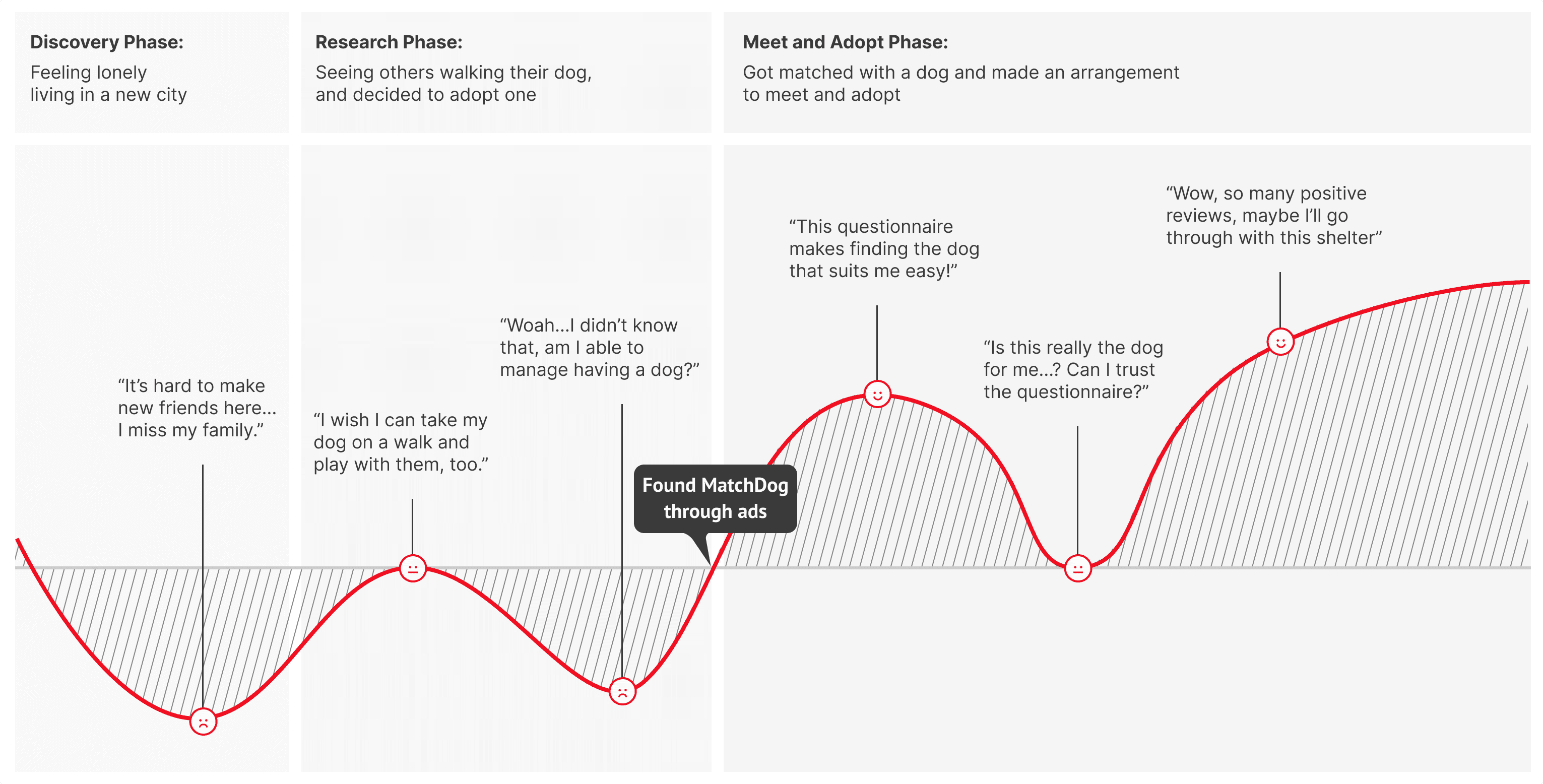
People would most likely access the app to adopt dogs and make donations
Summarizing the previous research, we listed down the transactional goals in the app in the form of actions and objects.
We organized the users' goals by determining "How often will the feature being accessed?" and "How frequent will they access?" to better understand where each feature should be placed.
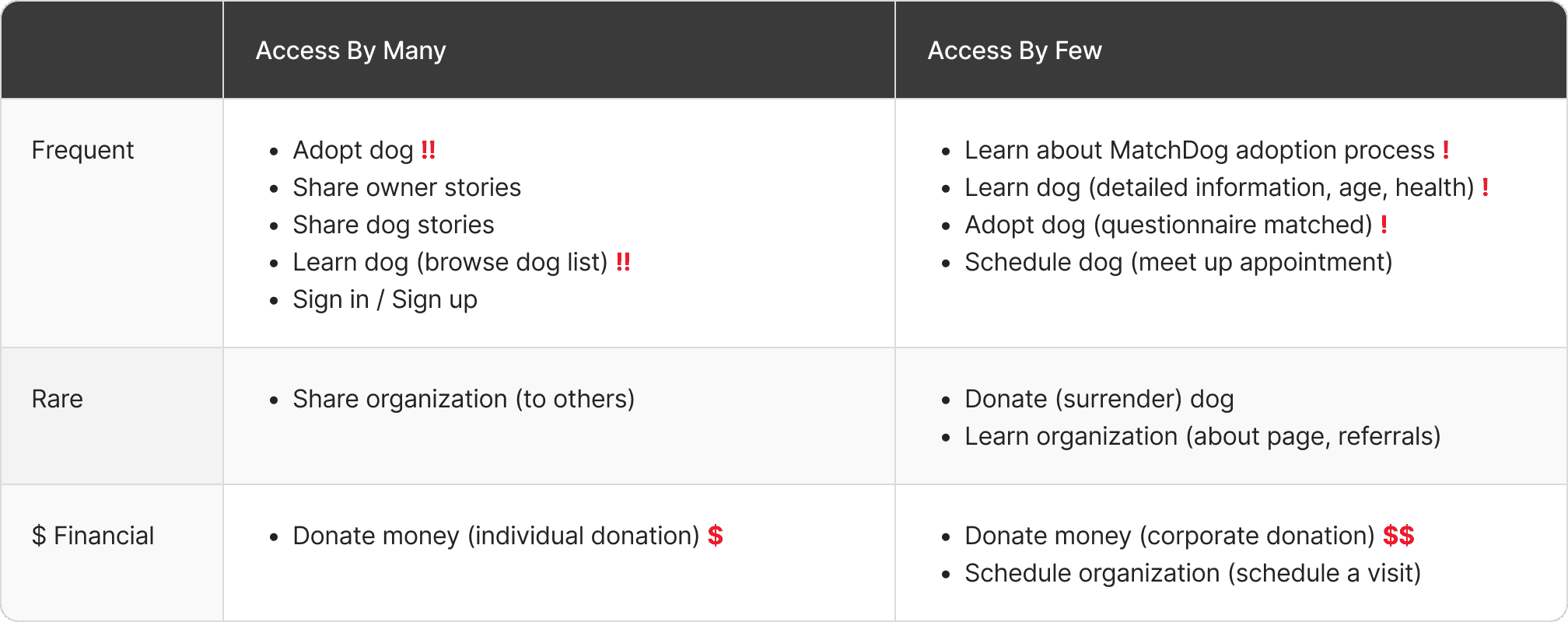
Wireframes
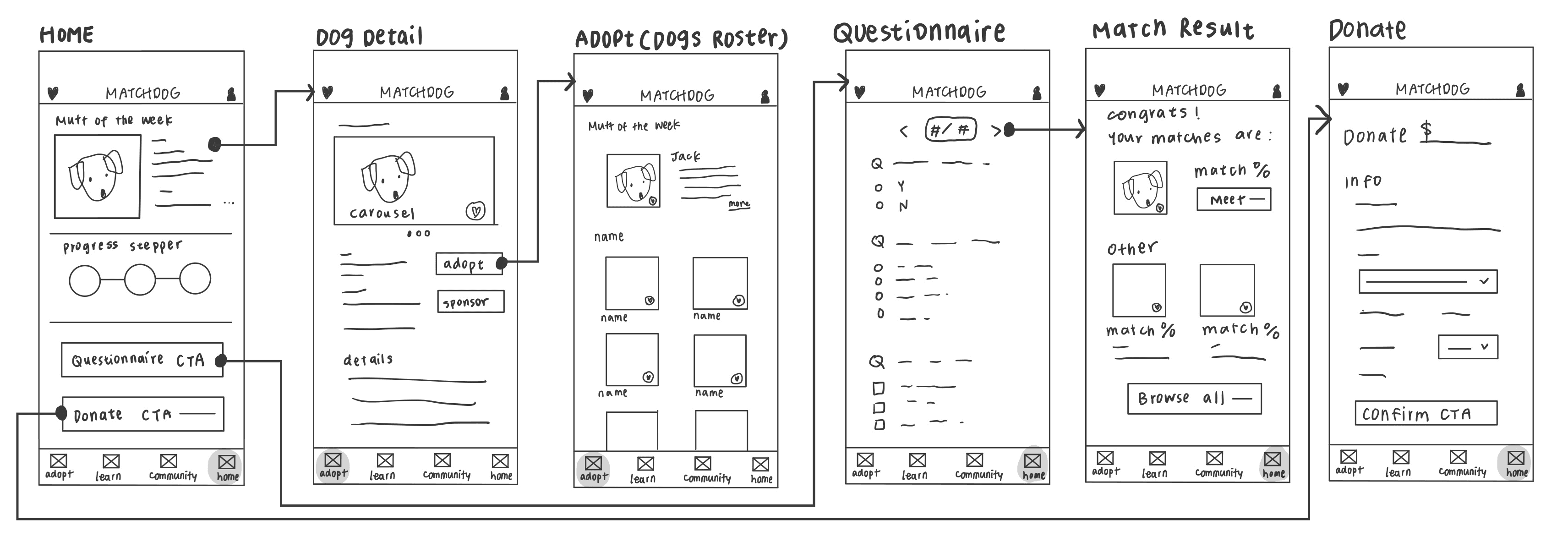
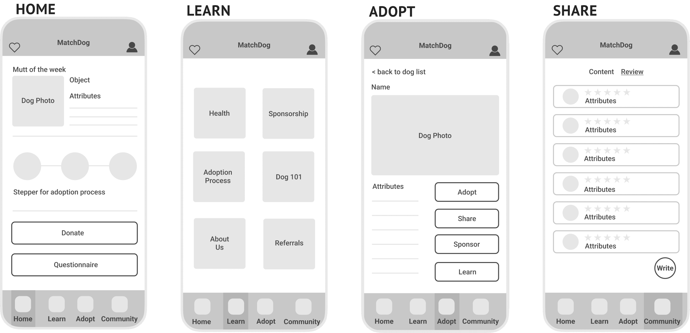
After ideating the concepts, I started brainstorming and sketching ideas to ensure I integrated all the essential features to meet major user needs. Following this, I created a flow map for for the primary user journeys to make sure I didn't leave out any screen and then proceeded to develop wireframes.
Mid-Fidelity Design
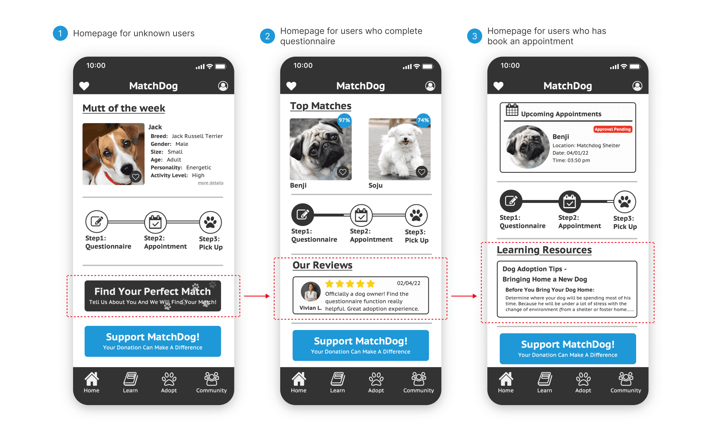
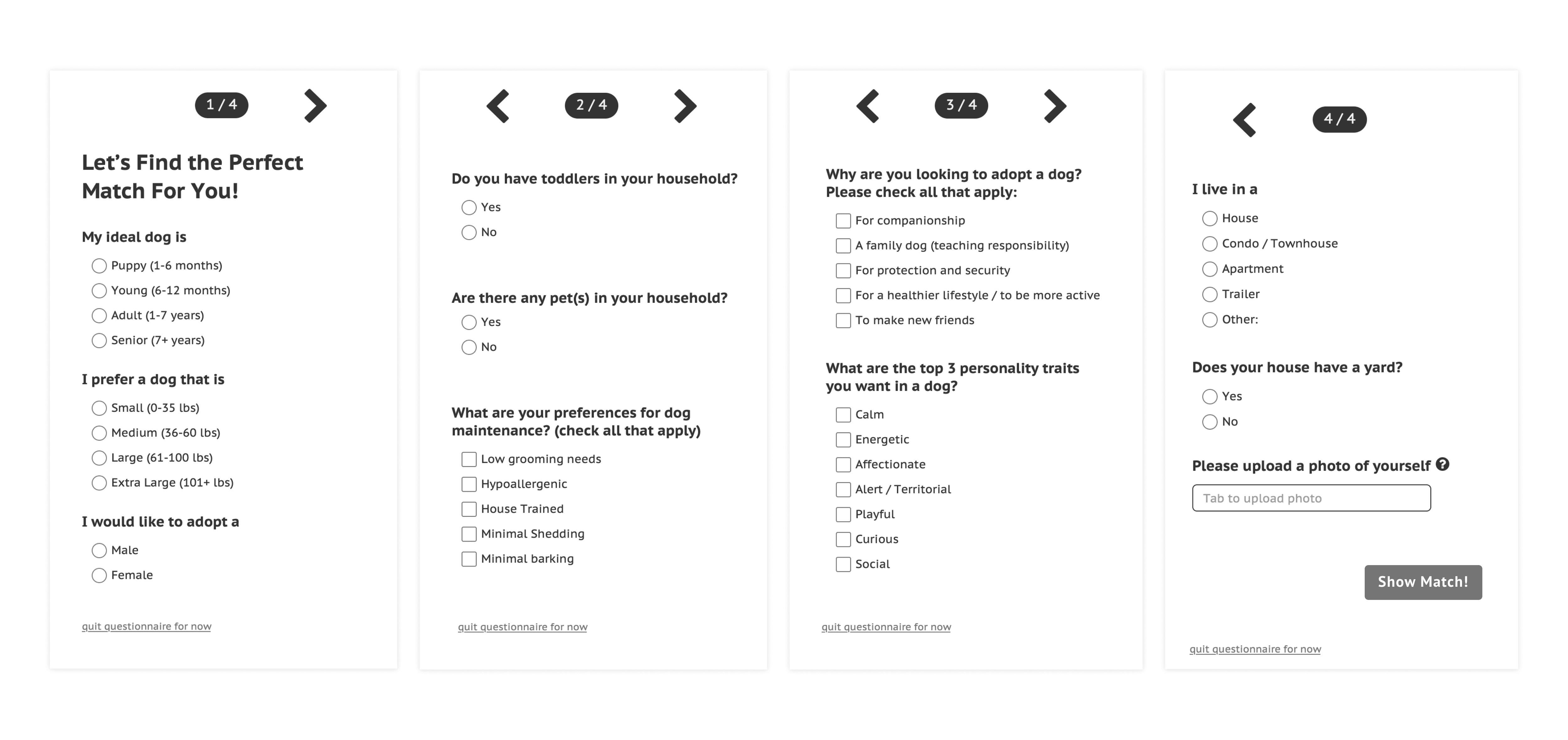
Matching adopters and suitable dogs with questionnaire
Users were encouraged to take a questionnaire in the beginning to get match with dogs based on their lifestyle and household size.
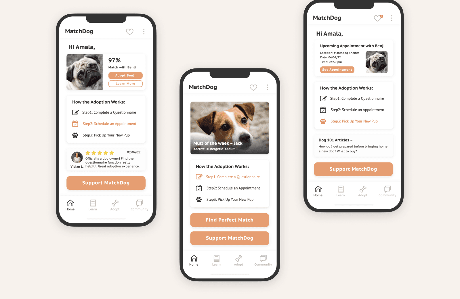
Personalized homepage for users during different stage
With the personalized homepage, for example, users will be nudged to take a questionnaire in the beginning. Then, successful adoption reviews will be promoted to the homepage to increase willingness to proceed to adoption.
Finally, after the appointment is booked, articles and resources will be shown on the homepage for last step preparation.
High-Fidelity Design
My mid-fidelity prototype went through a design critique to discover areas of improvement. I made iterations and brought the design to high-fidelity according to the feedback I received.
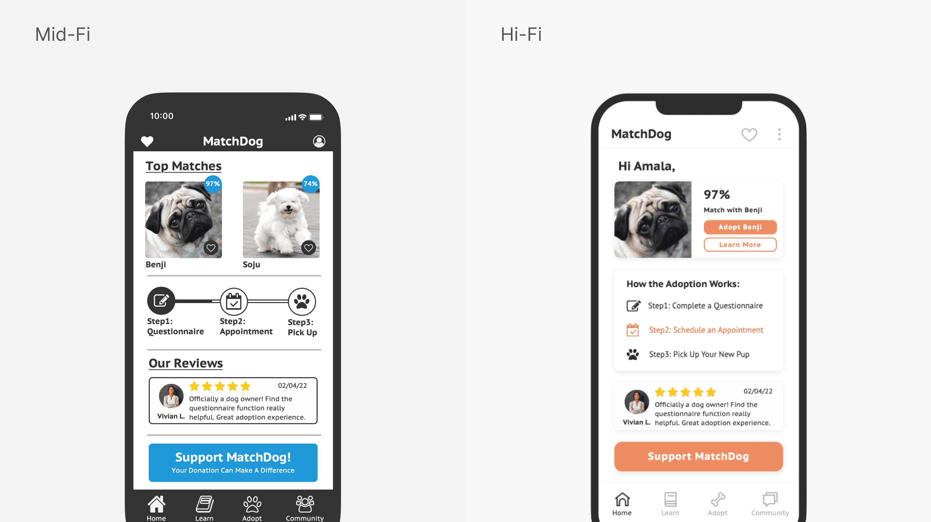
Improvement 1: Unifying the background color to achieve visual cohesion
One of the major changes with my design was that I unified the background colors, which initially looked clustered, and only highlighted the call-to-actions with color. By doing so, the critical information pops up clearly and straightforwardly.
Improvement 2: Clear action button to nudge the adoption process
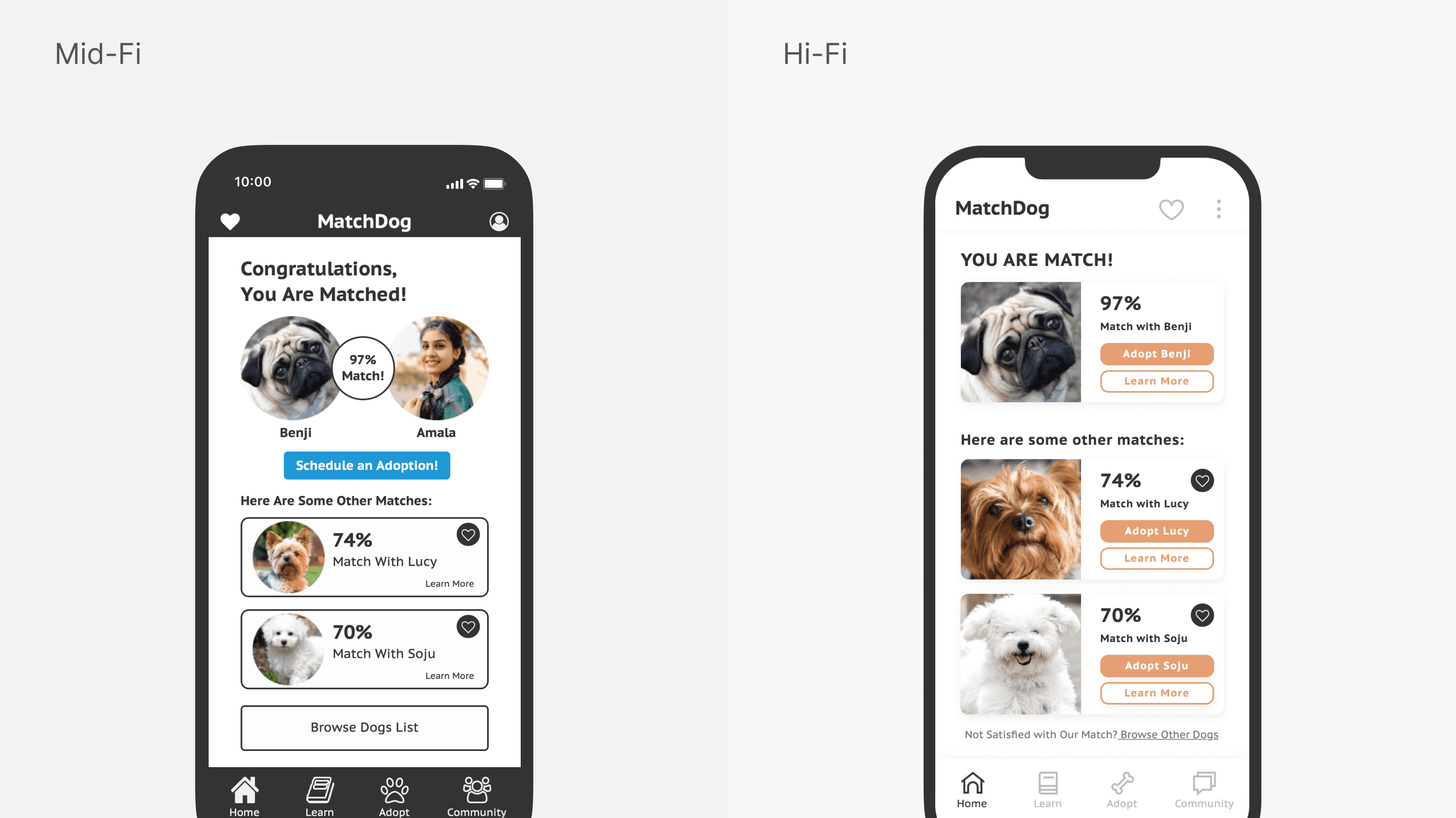
This is the matched screen after completing the questionnaire. In the original design, users were only given CTAs to "schedule an adoption" or "browse dog list." In comparison, the iterated version provides clear options to proceed to adoption or learn more about the dog.
In addition, I downsized the "browse dog list" CTA to a hyperlink that nudges users away from leaving the page. I also removed the confused-causing underlined headings and instead made each section clear and action-driven.
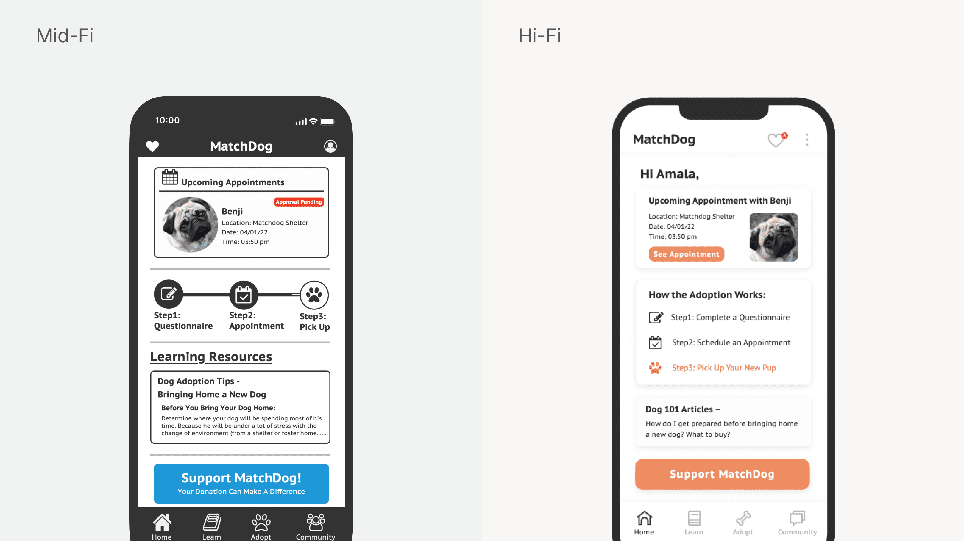
Improvement 3: Enhanced clarity in element usage for improved user engagement and understanding
I eliminated confusing underlined headings, opting for clear, action-oriented sections. Additionally, I avoided using warning colors to minimize confusion. The progress stepper was transformed into explicit step-by-step instructions, guiding users through the process and encouraging them to proceed.
Takeaways
It's my first time designing an mobile application
The MatchDog project was my first-ever UX design project, and I was super excited to put my knowledge into practice. I was also privileged enough to have my wonderful teammates to conceptualized the idea together and maintain cohesion on our individual design.
This project was completed as a mid-fi product. However, I decided to turn the mid-fi wireframes to hi-fi designs based on the comments I received and gave myself 24 hours to tweak the design. By practicing designing under tight time constraint, I learned to prioritize the tasks and allocate my time before getting my hands in the design, to enhance user experience.

